Where Art Meets Production.
From sketch to shelf. Thoughtful design, visual storytelling, and print-perfect detail that make brands and products come to life.
Design & Illustration
-
![Anime Coloring Art Kit – Design & Illustration Development]()
Anime Coloring Art Kit – Design & Illustration Development
Created for a CrownJewlz-branded Walmart new product line presentation, this concept highlights my design and illustration development for a themed art kit targeting young creators and anime enthusiasts. The kit concept included an anime-inspired coloring pad, a compact art easel, and organized displays of markers and crayons housed within a folding binder package. The image features a standing product rendering used to visualize the kit’s final retail presentation — showcasing cohesive design, packaging integration, and product storytelling for a successful category pitch.
-
![Diet Coke Gem Journaling Kit – Design & Illustration Concept]()
Diet Coke Gem Journaling Kit – Design & Illustration Concept
Developed for a CrownJewlz-licensed product presentation to Walmart’s craft department, this concept introduced a chic, DIY journaling experience inspired by the iconic Diet Coke brand. The kit was designed for an adult twenty-something audience and featured a vibrant, eye-catching package containing a custom journal, sparkling adhesive gems for personalization, and a curated art supply set. Presented as a digital rendering and product mockup, the design blended lifestyle branding with creative expression, offering a one-of-a-kind journaling experience that celebrates individuality and style.
-
![Coca-Cola Seasonal Craft Kit Designs – Adult Coloring & Paint-by-Number Concepts]()
Coca-Cola Seasonal Craft Kit Designs – Adult Coloring & Paint-by-Number Concepts
This project features a collection of Coca-Cola–branded creative kits designed for TJMaxx and Marshall’s seasonal craft category presentations. The concepts include two adult coloring kits and a Classic Santa paint-by-number set, each blending nostalgic Coca-Cola imagery with engaging, giftable creative experiences. Developed for the July 2025 retail buy trip, these product designs were created to appeal to the holiday shopper with collectible-style packaging, bright seasonal branding, and interactive content. The collage image showcases the proposed retail-ready packaging concepts prepared for buyer review ahead of the upcoming holiday season.
-
![Coca-Cola Stationery Collection – Licensed Product Design & Development]()
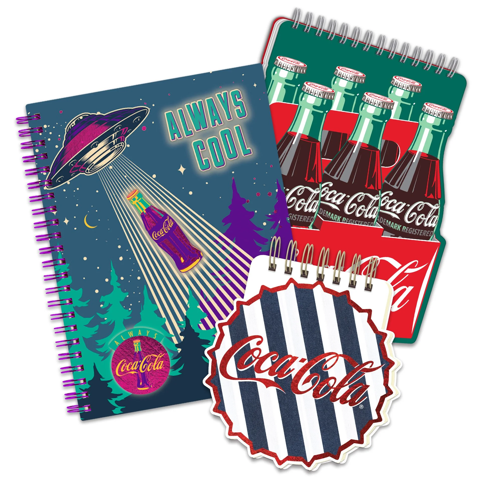
Coca-Cola Stationery Collection – Licensed Product Design & Development
This collage showcases a series of conceptual product illustrations developed for a licensed Coca-Cola stationery sales program. I designed the full product line, guiding each item through Coca-Cola’s brand compliance and approval process before preparing the artwork for print production. The collection was manufactured and distributed across multiple major retailers, including FedEx Office, Love’s Travel Stops, Five Below, Cracker Barrel, and TJMaxx. These designs combined brand nostalgia with practical everyday use, resulting in a cohesive stationery assortment that brought the Coca-Cola brand into diverse retail environments.


Packaging & Product Development
-
![Sharpie Metallic Marker Packaging Development]()
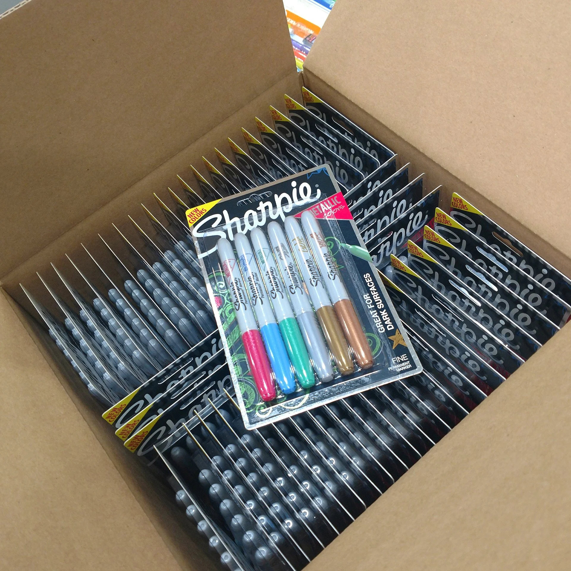
Sharpie Marker New Product Mockups
Developed as part of a retail line expansion for Sharpie’s Metallic Marker collection, this packaging project combined creative design with technical print execution. The blister-pack display was printed on metallic cardstock, using negative space to allow the reflective surface to enhance the product’s shimmer and shelf appeal. The development process included structural packaging design, color management for specialty substrates, and coordination of mass assembly for retail line review. The result was a bold, eye-catching presentation that showcased the product’s metallic brilliance while maintaining the iconic Sharpie brand integrity.
-
![Galderma Club Retail Packaging Restructure]()
Galderma Club Retail Packaging Restructure
This packaging development project focused on reengineering Galderma’s single-bottle and single-tub corrugated shipping cartons into dual configurations optimized for club retail environments such as Sam’s Club, Costco, and BJ’s Wholesale. The redesigned structures were developed to maximize shelf efficiency, improve stacking stability, and enhance product visibility while maintaining manufacturing feasibility. Each new package underwent successful production testing before being transferred back to Galderma’s internal art department for final branding and graphic application. The result was a functional and scalable packaging solution tailored for high-volume retail presentation.
-
![Sharpie Metallic Markers Launch Kit]()
Sharpie Metallic Markers Launch Kit
An immersive influencer experience kit designed to celebrate Sharpie’s new Metallic marker line. This custom shipper transformed unboxing into a branded moment — featuring layered packaging, shimmering accents, and a built-in product display that revealed the markers in a dramatic metallic gradient. Inside, recipients found premium paper stock for testing, a printed sales booklet, and carefully curated design elements that showcased the markers’ luster and versatility. The result: a tactile, high-impact presentation that connected creativity, craftsmanship, and brand storytelling in one unforgettable delivery.
-
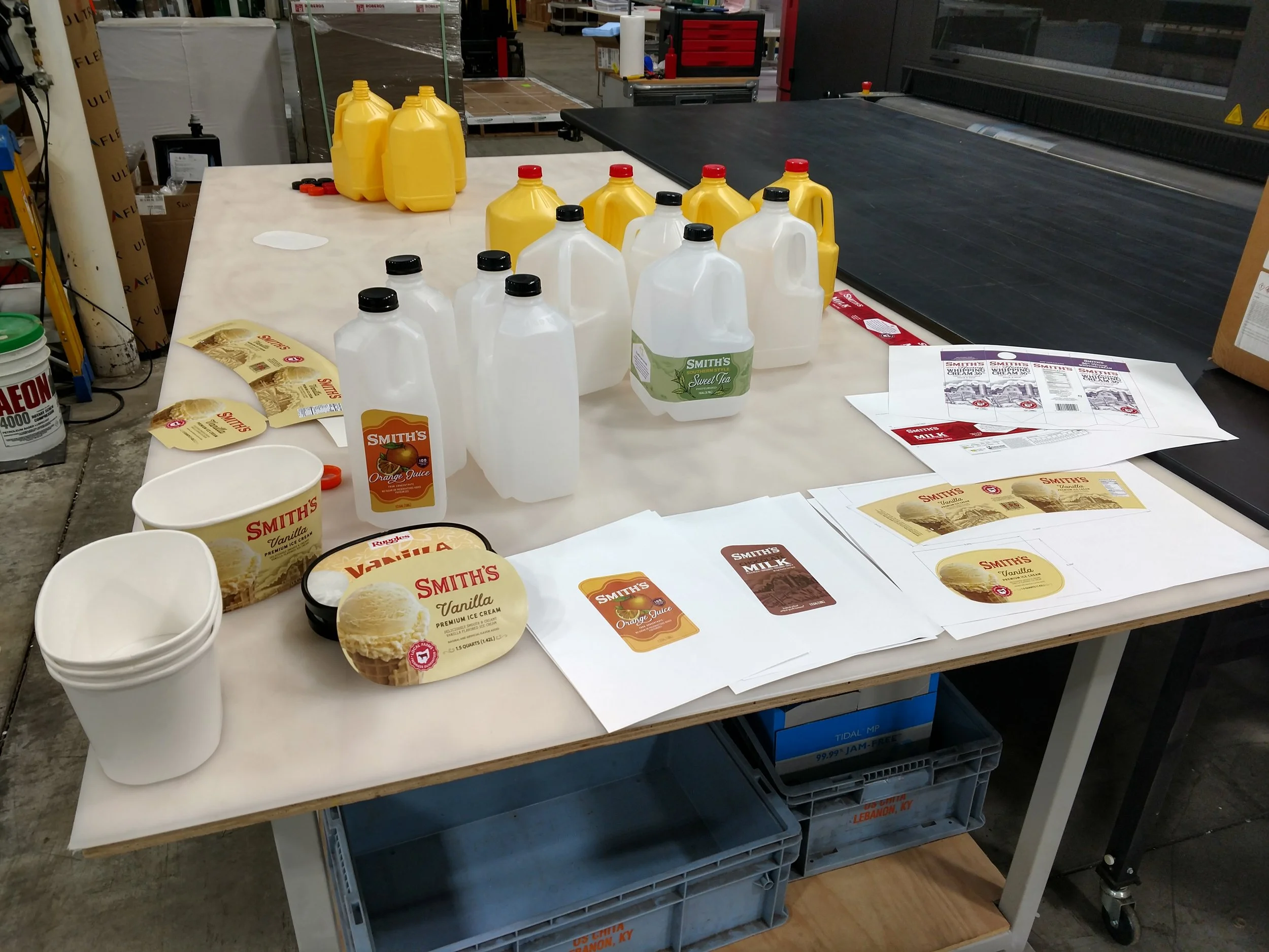
![Smith Dairy Branding & Packaging Prototype Development]()
Smith Dairy Branding & Packaging Prototype Development
This project supported Smith Dairy’s corporate brand relaunch by developing and testing new packaging and label applications prior to full production rollout. I worked hands-on with prototype cartons and printed labels to evaluate fit, alignment, and print quality across multiple packaging formats. The photo captures part of the pre-launch process — blank cartons ready for assembly, freshly printed labels awaiting application, and flat, printed packaging components staged for the final review meeting. This preparation ensured the new branding was production-ready and visually consistent for the company’s internal product launch presentation.
-
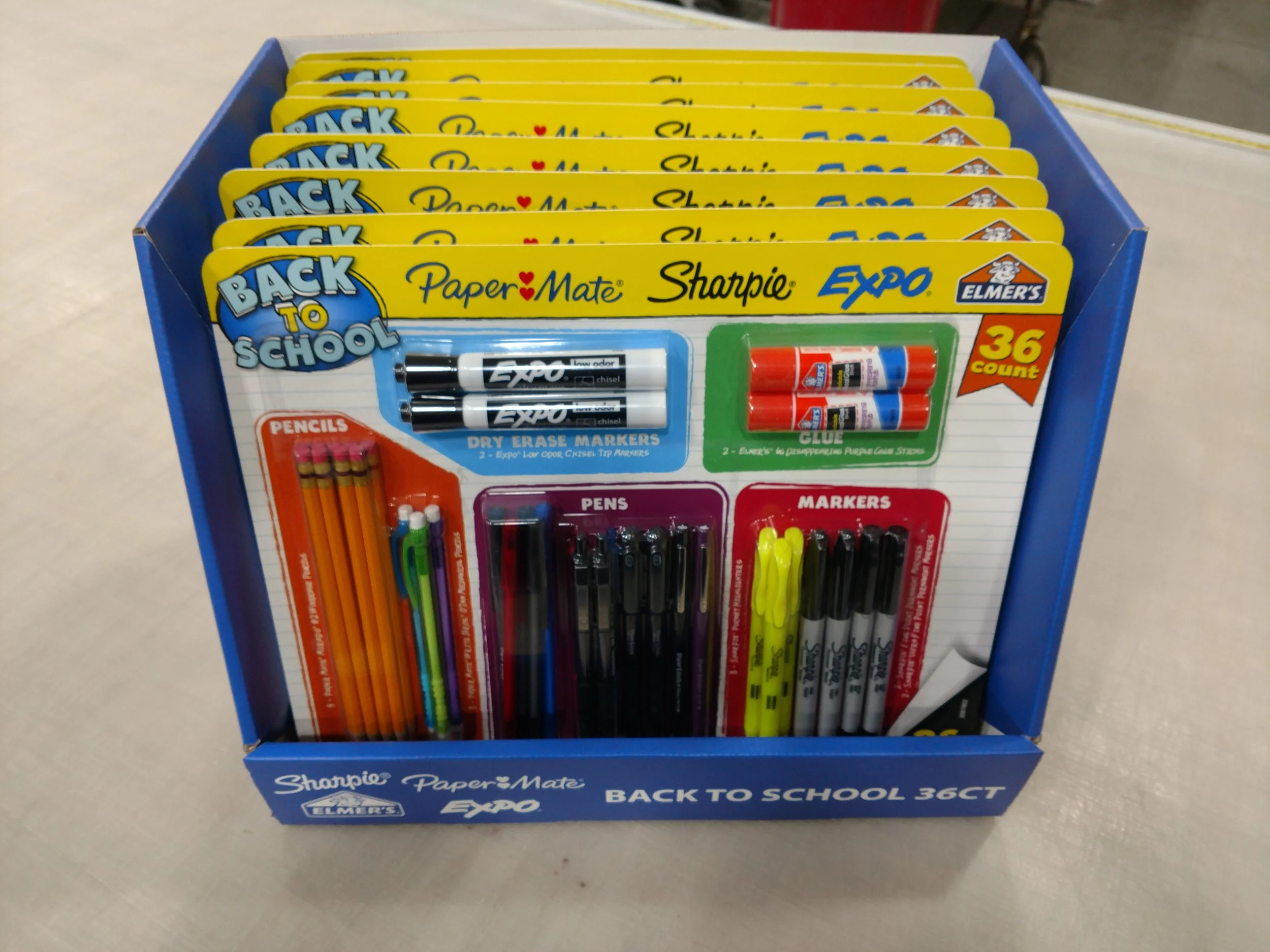
![Walmart Back-to-School Collaborative Packaging Program]()
Walmart Back-to-School Collaborative Packaging Program
Developed for Walmart’s national back-to-school campaign, this project brought together four major stationery brands — PaperMate, Sharpie, Expo, and Elmer’s Glue — into one cohesive packaging and display system. The program included multi-brand blister packs mounted on a shared rigid paperboard backer and a coordinated PDQ shelf display designed for high-traffic seasonal aisles. I contributed to packaging layout development, product fit testing, and final assembly coordination prior to shipment. The image shown features the completed product packs arranged in their branded shelf display, ready for distribution to retail stores.
-
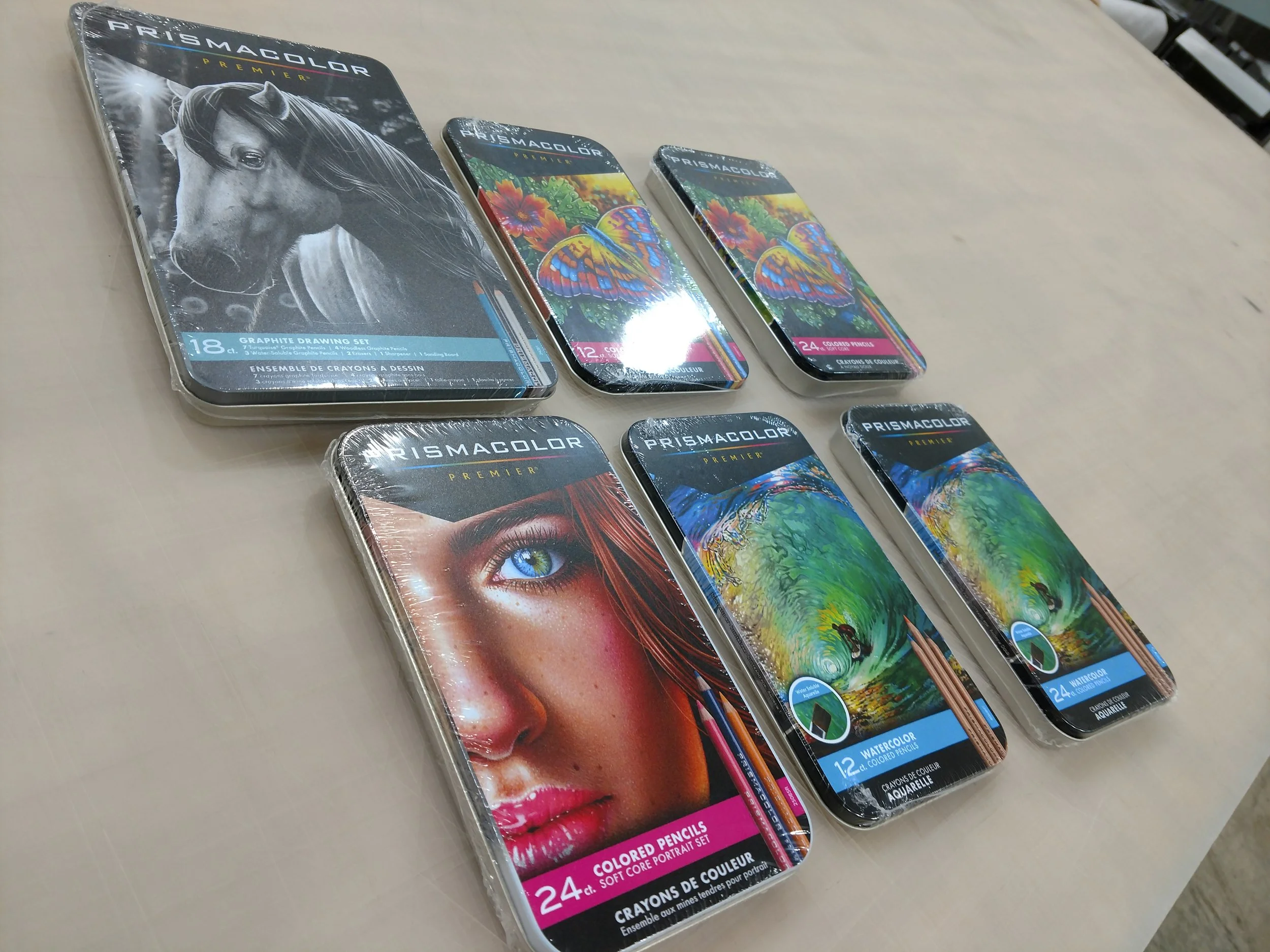
![Product Relaunch Labeling & Presentation Preparation]()
Product Relaunch Labeling & Presentation Preparation
This project involved preparing existing product lines for an internal launch presentation by applying newly updated branding and packaging artwork. I adapted the supplied design files to create custom-fit labels for the provided product tins, ensuring alignment, consistency, and a professional presentation finish. Each item was then shrink-wrapped for a shelf-ready appearance, giving the samples the look and feel of a fully launched retail product. The photo captures the final, relabeled product sets prepared for the client’s brand review and marketing rollout.
-
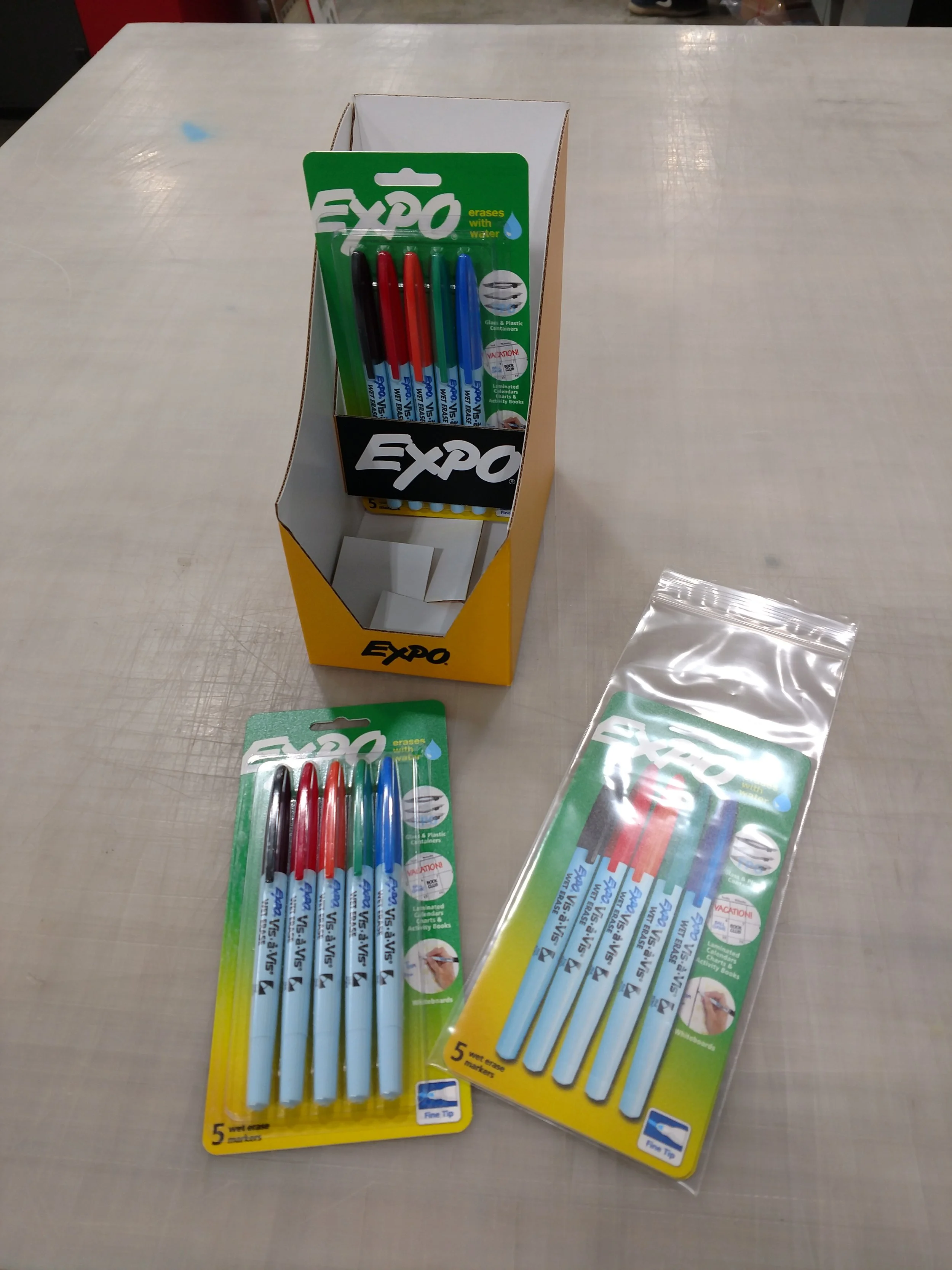
![Expo Dry Erase Marker Line Review Packaging Assembly]()
Expo Dry Erase Marker Line Review Packaging Assembly
This project supported Expo’s product line review by developing realistic, presentation-ready packaging prototypes. I collaborated with a production team to print and cut double-sided backer cards, assemble blister packs with supplied markers, and mount them to display-ready card backs. To enhance the presentation, I also created simulated product backers featuring printed images of the markers to give the display a fully stocked appearance. The assembled packages were arranged for a corporate review meeting, providing a polished, retail-ready look that showcased the brand’s updated packaging design and merchandising potential.
-
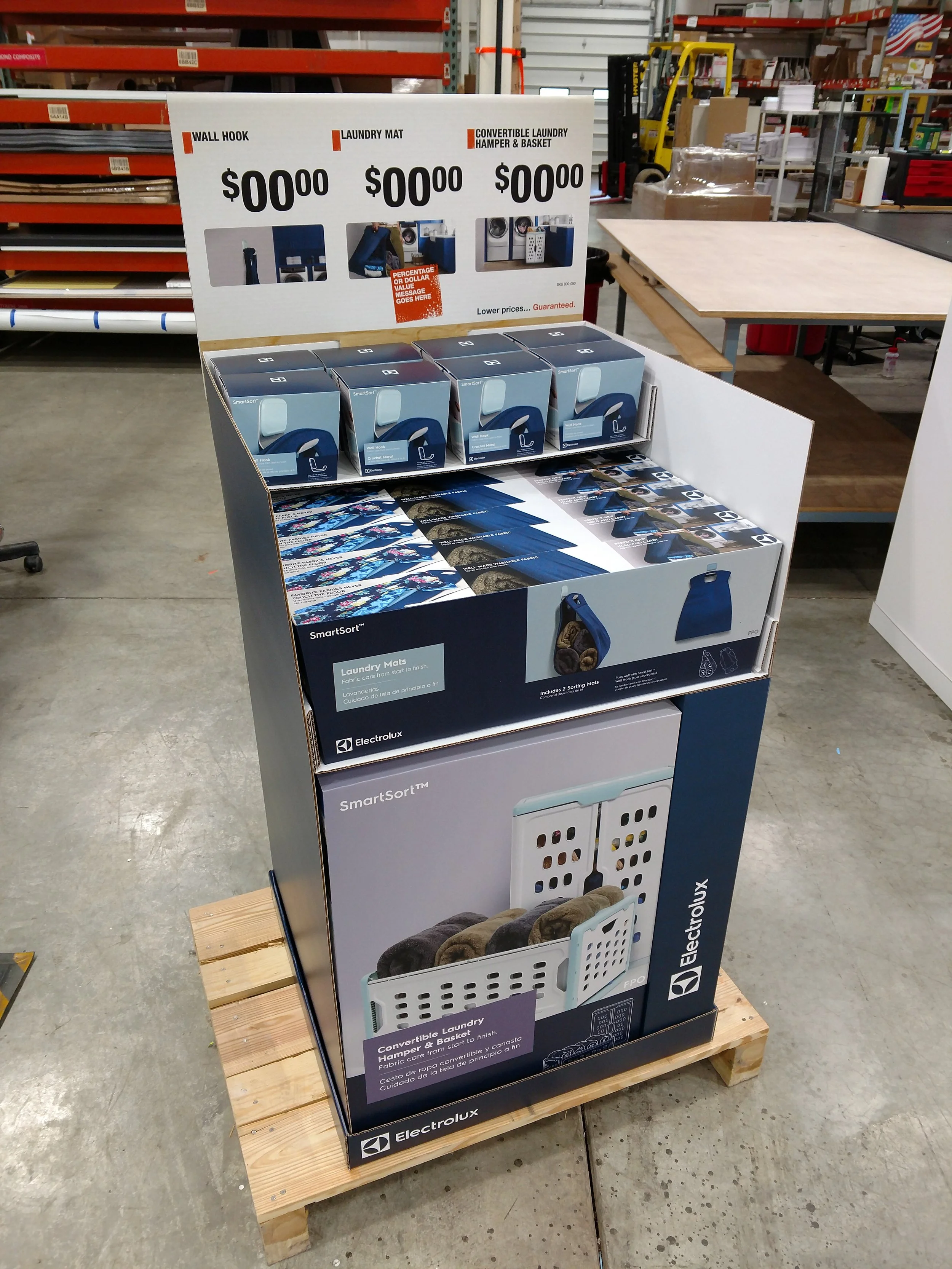
![Electrolux Point-of-Purchase Display Development]()
Electrolux Point-of-Purchase Display Development
This project involved hands-on collaboration in the production and assembly of a new point-of-purchase (POP) display for Electrolux. As part of the development team, I contributed to printing, cutting, and assembling display components, then loaded supplied product samples to test shipping durability and retail-level usability. In addition to production testing, I led the creation and photography of a step-by-step assembly instruction sheet that shipped with each unit, ensuring retail teams could easily reassemble the display and merchandise the products as intended. The result was a fully functional, visually cohesive display system ready for distribution and in-store execution.


Branding & Marketing Material
-
![Esoteric Brewing Co. Logo]()
Esoteric Brewing Co. Logo
Working closely with the founders of Esoteric Brewing Co., a small craft brewery based in Cheyenne, Wyoming, I developed a complete visual identity that captures the brand’s independent spirit and refined approach to brewing. The project included a custom logo design and supporting brand elements that reflect the brewery’s name — blending a sense of mystery, craftsmanship, and authenticity. From concept sketches to final digital build, the brand was crafted to translate seamlessly across packaging, signage, and digital media, giving Esoteric Brewing Co. a strong, cohesive presence ready to grow with their business.
-
![Sell Sheets for Partyware Sales]()
National Retail Marketing Initiative
These sell sheets showcase the complete top-of-table partyware collections for Coca-Cola and Hallmark seasonal programs. Each layout was designed to highlight coordinated product assortments — including paper dinner and dessert plates, matching napkins, oval platters, and themed corrugated display units. The sheets featured both compact shelf displays and full standing floor displays stocked with branded products, providing retailers with a clear visual of the in-store experience. Created for the CrownJewlz sales team, these polished presentation tools were distributed during key seasonal selling periods, helping buyers visualize ready-to-ship, fully merchandised collections built to drive impulse sales and brand engagement.
-
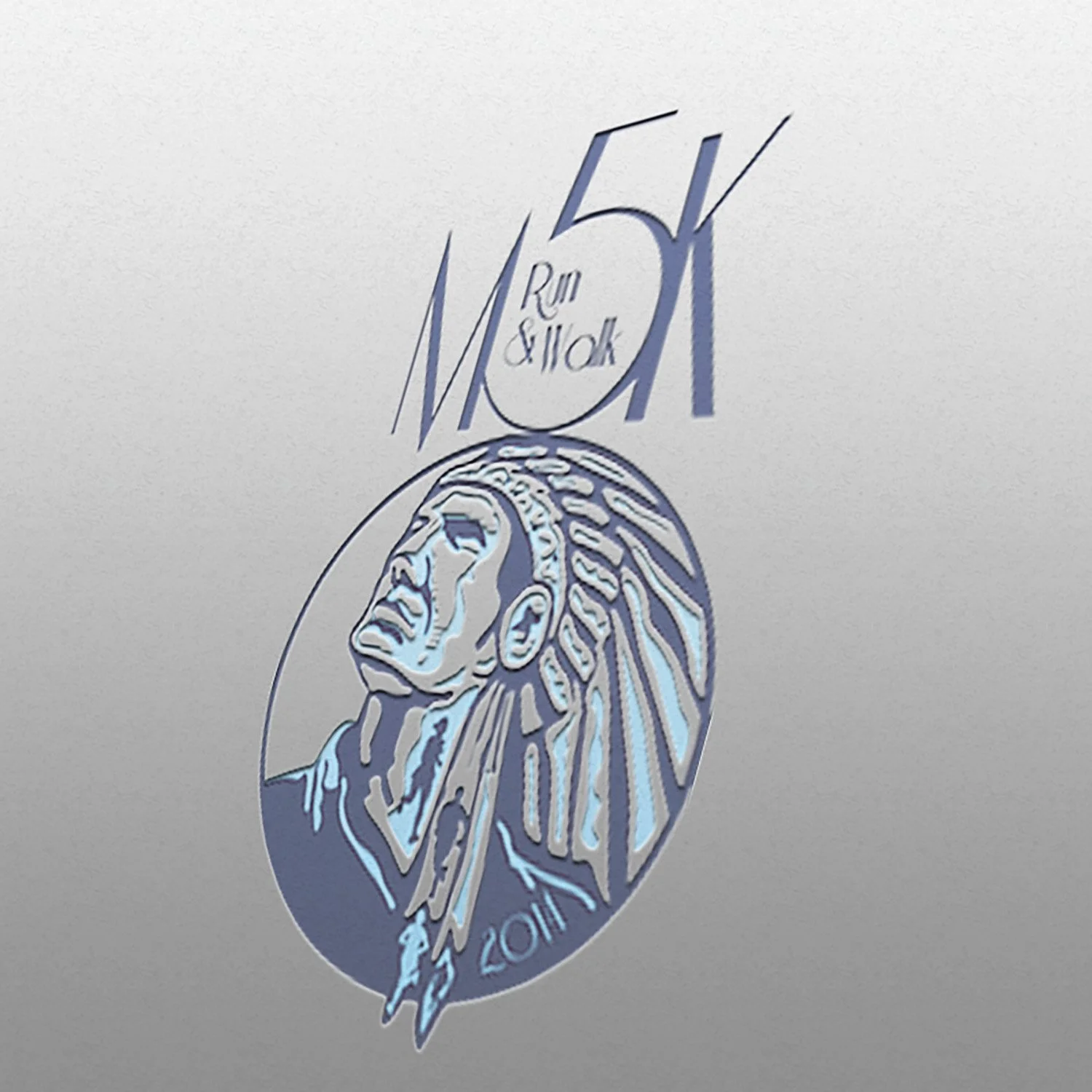
![Mohican 5K Walk & Run – Logo Concept Development]()
Mohican 5K Walk & Run – Logo Concept Development
This logo concept was created for the organizers of the Mohican 5K Walk and Run event, designed for use across t-shirts, event banners, and promotional literature. The concept captures the spirit of community, movement, and the natural beauty of the Mohican region through clean, versatile design elements suitable for both print and digital applications. The image shown features an embossed logo mockup on an event asset, illustrating how the mark could translate across various branded materials with texture and impact.
-
![Restaurant Concept & Branding Development]()
Restaurant Concept & Branding Development
Exploring my passion for branding and visual storytelling, I developed a series of original restaurant concepts complete with mock menus, identity systems, and style guides. This project showcases one of those concepts — a fully imagined restaurant theme brought to life through cohesive design and brand vision. The image displays a mockup of the restaurant’s logo applied to a frosted storefront window, offering a glimpse of how the brand identity could appear in a real-world setting.


Behind the Scenes
-
![Puzzlebook Print File Workflow & Production Management]()
Puzzlebook Print File Workflow & Production Management
This project showcases my complete design-to-production workflow for a set of four themed puzzlebooks. In this example, I not only created the cover artwork but also managed the entire project from initial concept through factory-ready file delivery. The image displays a screenshot of the final Adobe Illustrator print layout, showing all four book covers prepared for production and submitted as a coordinated set. This project highlights my proficiency in file preparation, color management, and efficient communication with overseas print vendors to ensure accuracy and consistency through every stage of production.
-
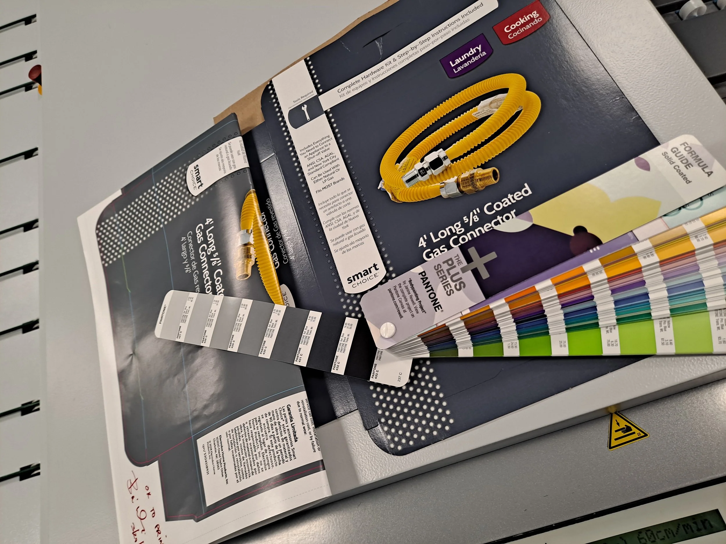
![Prepress Color Troubleshooting – Print Production & Quality Control]()
Prepress Color Troubleshooting – Print Production & Quality Control
This behind-the-scenes example demonstrates my prepress troubleshooting experience in resolving color consistency issues between proof and press production. The image shows a printed color proof beside a finished package and Pantone swatch book used during analysis. A subtle yellow tint from a low-grade substrate had caused the printed brand color to appear darker than intended. By switching to a purer white stock and implementing press-level adjustments, I led the resolution that restored accurate brand color reproduction. This project reflects my technical precision and commitment to maintaining visual integrity from proof to final production.
-
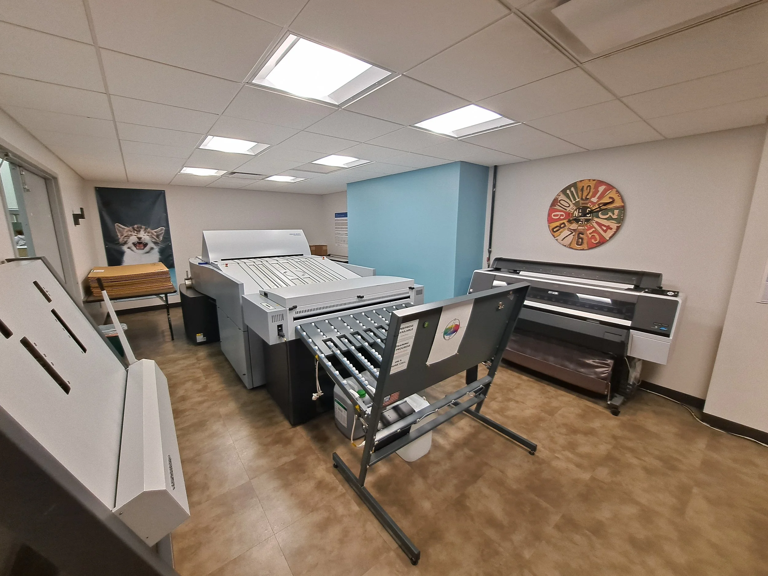
![Prepress Department & Workflow Environment]()
Prepress Department & Workflow Environment
This image offers a behind-the-scenes look at the core of my prepress workflow — featuring a Heidelberg platesetter (center), plate crimping tools (left), and an Epson P9000 proofing printer (right). As the lead of this prepress department, I often referred to it as the hub of the printing business, where every project links its journey from concept to production. It was here that I learned the intricate relationship between design and print — managing color, precision, and process control firsthand. This environment became the foundation of my expertise, deepening my understanding of how technical accuracy and creative design come together to produce exceptional printed results.
-
![Substrate Reference Tool – Cross-Department Workflow Innovation]()
Substrate Reference Tool – Cross-Department Workflow Innovation
During my time in large-format print production, I noticed a recurring disconnect between sales, design, and production teams when discussing substrate materials. Each department used different names for the same materials, and customer service often lacked clear specifications — creating delays and confusion. To solve this, I collected samples of every substrate used in production, labeled them with detailed technical specs, and assembled them into a comprehensive reference guide. This simple but powerful tool bridged communication across departments, standardized terminology, and streamlined project quoting and production accuracy. Years later, the company still uses this resource as part of its daily workflow — a lasting example of how design thinking can improve operational efficiency.